One of the aspects of doing animation in Adobe Flash that I found interesting is the whole process of manipulating each image to make them animate. It is interesting how much time and detail is spent on trying to give the illusion of an object in motion. The concept of the Shape Tween was interesting to see the many shapes in Flash morph into another shape very smoothly on the screen. Secondly, it was interesting using the various tools used in graphic editing to create animations. Another aspect of animation I found interesting is that you are free to create and express yourself through animating various characters and their surroundings. There are no restrictions when it comes to animation because it’s an alternate world one can experiment, create and express throughout.
In my animation project I’m happy with what I was able to put together overall since it was my first time using Adobe Flash. I’m also happy in the process of learning little by little as I explored the program of Flash as I was creating my own animation simultaneously. I would not change much in my animation that I created since it is a very basic animation for a beginner’s level as me. One of the things I learned unexpected was time and detail process it takes overall to create animations within Flash.
I always had an appreciation for animators and animation as an art form. My appreciation has even grown more because the process in creating animation takes a lot of time and detail spent on them. The process of creating an illusion of movement on screen is a tremendous task while telling a story.
I was little more familiar with video editing oppose to animation so the process is different. It’s different for me because in video editing your working primary with moving video images already on screen opposed to animation you have to create everything from scratch yourself. In addition, with video editing it’s easier for me to visually manipulate moving action through video while telling a story. Nevertheless, I still found the animation process and the program Flash fun and interesting at times.
Thursday, December 9, 2010
Friday, November 5, 2010
BLOG #3: Production Notes
It was a fun process in completing the video project in reflection. The shooting and editing process was collectively interesting and worth while. After completing the public service announcement video project process, there are a few things I would do differently if given the chance.
One of the things I would do is during the video project is to try to film more B-roll shots as possible. The more B-roll shots that you have access to you can then use them to inter-cut with the main shot of an interview. I believe we should have gotten little more B-roll shots just to be safe even though the video works well I feel with what we had filmed.
Another thing I would do during the video production is to get more interviews as possible. It can become difficult to get people to appear on camera for interviews at a short notice oppose to a pre-planned scheduled interviews. I think maybe we should have made an effort more to get more interviews, but we had some time constraint that has to be considered on the shoot. However, we were able to get some promising interviews that worked very well for the video.
Some of the aspects of the project I like are that we were able to put together a concise video from the footage we shot on the shoot in post production. It all came together very well when we started to lay down our video clips to edit. Secondly, the other aspect of the project that I liked was the script because it helped guide us right through during the video shoot. There is not much I would change about the video project other than what I’ve said previously.
If anything I would change or add in the video project is to probably have a continuous theme throughout after every narration. The continuous theme may have been of students walking sped up with effects and Hunter College logo shot on video. In any case, it would have been an idea, but it’s not highly necessary to make the video effective because it still works well as it is already. I learned even more that you have to shoot and hustle along to the next shot as possible when you have time constraints.
Wednesday, October 6, 2010
Blog #2: Editing Analysis
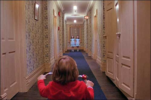 In the 1980, psychological horror film “The Shining” directed by Stanley Kubrick is about a writer with a wife and young son who accepts the job of off-season caretaker at an isolated hotel. As in a lot of psychological horrors, they rely on character fears. The purpose is to develop a feeling of uneasiness by exploiting human fears that we all have within. The film takes the viewer ever so gradually descending into insanity driven by isolated and claustrophobic living conditions. There suggestions made throughout the film that the hotel may be haunted. In the film “The Shining” this technique in exploiting human fears is captured throughout. One of the significant contributions to the film is in a short scene yet is very effectively shown through editor by Ray Lovejoy.
The young son Danny Torrance (Danny Lloyd, actor) who possesses psychic abilities, is able to see things in the future or past, such as the ghosts in the hotel. In the ‘Hallway’ scene Danny Torrance is seen exploring the hotel as he rides his tricycle through and around in the corridors in a medium long shot. Danny is terrified when he confronts the two undead girls at the end of a hallway blocking his way as the stand from a distance -- Danny is shown in a close-up. The two undead girls beckon to him in metallic voices: "Hello Danny, Come and play with us. Come and play with us, Danny." Danny is horrified to see a slide-show flash with horrific images of the carnage of past murders. The two mutilated girls lie in pools of blood in a blood-splattered hallway, with an axe lying on the floor in front of them. In the scene you can see the recurring shot of a quick cut to a long shot of the two mutilated girls lie in pools of blood in a blood-splattered hallway. Secondly, the scene progresses as the two undead girls move closer on screen which builds the tension of the scene. The shot first shot of Danny looking down the hallway at the undead girls with a use of a wide angle lens which gives the shot a wide field of view. The music score helps to build the tension of the scene as well. The way the cuts are edited very quickly between shots of Danny, the undead girls and the two mutilated girls creates the simultaneous tension.
In the main sequence of each shot edited as follows: The first shot - wide shot of Danny looking at the two undead girls at the end of the hallway. The second shot - a close-up of Danny’s terrified expression of two undead girls at the end of hallway. The third shot - another wide shot of Danny looking at the undead girls at the end of the hallway. The fourth shot - a quick cut to a long shot of the two mutilated girls lie in pools of blood in a blood-splattered hallway. The fifth shot - a long shot of the two undead girls at the end of the hallway. The sixth shot - another a quick cut to a long shot of the two mutilated girls lie in pools of blood in a blood-splattered hallway. The seventh shot - a very quick close-up of Danny’s reaction as he is very frightened. The eighth shot - a very quick long shot of the girls standing, but more closer as they have moved closer on screen in the previous shot. The ninth shot - another repeated quick cut to a long shot of the two mutilated girls lie in pools of blood in a blood-splattered hallway. The tenth shot - we now see the two undead girls in a medium long shot/two shot standing even closer on screen. The eleventh shot - another a quick cut to a long shot of the two mutilated girls laid in pools of blood in a blood-splattered hallway. The twelfth shot - a close-up of Danny has he is terrified. He sinks deeper into his alter ego - seeking out the protection of his imaginary friend, Tony. The thirteenth shot - a wide shot of Danny looking down an empty hallway now there is no undead girls visible.
Monday, September 20, 2010
Blog Entry #1: What I Hear Around Me
I hear many sounds around me on a daily basis in the air around me. Some of these sounds that I hear may include from people’s voices or automobiles outside. The many sounds are inescapable from the loudest to the lowest sound.
I also hear media very often it is around me on a daily basis just like any other sound. However, the media’s impact plays a more important role of what I hear around me. The music that played on radio stations can be heard in my home. The radio is able to reach a vast amount of people in a short time. A trip to the supermarket or shopping in a clothing store I hear the radio station music being played over speakers. I hear the sound of a radio station playing music coming from automobiles. The radio can be heard over the internet as many sites now broadcast their programs via web.
The impact of digital media when it comes to hearing media is vast. The use of digital media such as compact discs (CD’s) can be heard. I hear music or audio in my home on a stereo or on my computer’s CD-ROM. The sound music or audio can be heard on video game consoles as it plays audio CD’s. I hear music or audio on cellular phones from people near me as the music is played from their phones. I can hear music, audio or varying sounds on a websites via internet either for advertisement purposes or interactive material for the website.
The conversation of media I’ve heard taken place many times among people without them being conscious of it. For example, I hear people talking about a music or audio on their cellular phone that was playing. I hear people talking about various television shows and a current news event that made headlines either by newspaper or television without realizing that media is what they are discussing indirectly.
Thursday, May 20, 2010
BLOG #4: Reflection On The Class
In the class MEDP150 the readings worked for me well. The readings in the text book and other reading materials that were assigned explained the subjects well. The readings were presented in an easy language so I was able to comprehend the subjects as I read on. It accompanied by pictures in the text were a huge help in further understanding the material as well.
In addition, the concise definitions and terms in the text were very helpful and provided a clear understanding of the material on each subject. The lectures in the class were able to pull everything together from the reading material. I was able to further understand the material due to the lectures that was given in class.
I enjoyed basically all parts of the course but the ones I particular enjoyed was lectures on framing/composition and Lens and Lighting demonstration in the lab. The material presented was explained clearly and the pictures that were shown made it even more understandable. I would have appreciated more examples and hands-on demonstrations of camera shooting techniques squeezed in one of the lab sessions. My only complaint was that I wish there were more hands-on activities in lab. For example, I would have liked to see of hands-on video production and camera work applying what we covered in the lectures and readings. Nevertheless, this class was intended to be an introduction class briefly covering different areas of Media so I guess it‘s difficult to compact a whole a lot into one semester. I do feel like I’m leaving this course with introduction of new knowledge, but more hands-on would have been even more helpful. The one take away I will remember is a little of everything in the course.
Saturday, May 1, 2010
BLOG #3: Design I Like

One of the uses of Media Design is found within advertising posters through the late 19th century to current times. The use of designed advertising has always been effective in grabbing people’s attention to a product visually. In addition, advertising posters are able to communicate a message and conveying information about the product to the public. The advertisement posters that tended to catch my eyes were the vintage Coca Cola posters. I like looking at the nostalgic advertisement posters as the times changed and progressed with their advertisements.
One of those posters is the vintage 1950’s Coca Cola advertisement that features a mother and her young daughter having a drink of Coca Cola at a couple of bar stools in a diner. The poster grabs the attention of the viewer with the identical matching white shirts and red dresses by both females. The mother is shown sitting besides her daughter with a pleasant smile as she grazes at her daughter. The young child sits with her legs crossed sipping on a glass of Coca Cola through a straw. The advertisement conveying a pleasant time spent between a mother and her daughter sharing a glass of Coca Cola. The poster visually tries to convey a wholesomeness correlation between family and the product. The poster sends a message also that everyone can and does enjoy drinking Coco Cola. The uses of colors are always consistent with Coca Cola advertisements with its red and white or sometimes black colors are found somewhere. In this case both mother and daughter are wearing red and white clothing. The background here is black which makes both of them stand out within the poster even more.
Another interesting advertisement attention grabber within the poster is the typography used in the poster that conveys information. The famous typeface of Spencerian script shows the Coca Cola logo. The use of the typeface is very recognizable in the poster as it viewable between both females. The Coca Cola logo is shown in white on a red circle shape and the glasses even have the Coca Cola logo white letters on them. The slogan used in this advertisement in the poster is found at the bottom of the poster in all gold capitalized letters ’REFRESH AT OUR FOUNTAIN’. The capitalized letters are quickly visible to the eye which is an effective way to make sure the person sees it. The slogan is short and straight to the point. The slogan also sends a message that its beverage will rejuvenate the person with a drink of Coca Cola. There is a complete balance between both females in the poster even though the mother is bigger in size.
The 1950’s vintage Coca Cola advertisement poster is very simple and direct, but it’s very effective throughout its design. The consistent use of the same colors and positive image within Coca Cola has made it very successful brand beverage and connection among its customers. Coca Cola has continued to use the same design techniques only adding newer ideas around the product to advertise it through television, billboards, magazines and websites.
Thursday, April 15, 2010
BLOG Entry #2: What I See
In Alfred Hitchcock’s film Psycho(1960) the technical choices have an impact on the film. In the opening scene there is an establishing shot of a tall building in an extreme wide shot as the camera slowly pans into a window of a couple undressed. The idea is important in the film because it presents an intrusion on personal space of character which Alfred Hitchcock captures. We as the viewer enter into their private space with the use of the camera movements such as the opening scene.
In another scene later in the film Norton Bates a motel manager in his parlor removes a picture from the wall that reveals a peep hole. He then proceeds to look through the peephole at Marion Crane as she undresses. The sense of voyeurism is present in several of these shots. The first shot shows Norman Bates in a close up with a low key lighting as the light shines through the peephole onto his face. The second shot showing Marion Crane in a medium long shot undressing. Then the third shot showing an extreme close up of Norman Bates eye from his point of view again looking though the peephole. There is use of a telephoto lens for the shot of his eye as he looks though the peep hole.
The film also presents fear of authority such as in the scene when Marion Crane is awaken by a police officer as she lies in her car sleep on the side of the road. In the first shot there is a long shot of hills and her car as the police car drives into the frame of the shot. The second shot shows the police officers getting out of his car as he proceeds to her car in a long shot. In the next shot there is a close up he looks into the car window. Then a quick shot of Marion Crane lying down in the car in a medium close up into a close up of her rising up startled. The scene continues with several close up shots of both her and the police officer. The director Alfred Hitchcock was able to revel within several shots in the scene that explores fear of authority figure. In addition, it shares that same fear with the viewer as Marion Crane is filled with guilt and concern.
One of the most interesting aspects of the film is the shower scene as Marion Crane is stabbed to death in the shower. The film halfway throughout has established Marion Crane as the protagonist, but she ends up dead. Her death moves the plot of the film along. Hitchcock was able to grab the audience and identify with Marion Crane for the first half of the film. The shower scene has several close up's and extreme close up's of Marion Crane screaming as Norman Bates stabs her to death.
Subscribe to:
Comments (Atom)