One of the uses of Media Design is found within advertising posters through the late 19th century to current times. The use of designed advertising has always been effective in grabbing people’s attention to a product visually. In addition, advertising posters are able to communicate a message and conveying information about the product to the public. The advertisement posters that tended to catch my eyes were the vintage Coca Cola posters. I like looking at the nostalgic advertisement posters as the times changed and progressed with their advertisements.
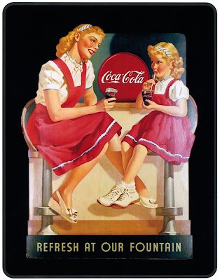
One of those posters is the vintage 1950’s Coca Cola advertisement that features a mother and her young daughter having a drink of Coca Cola at a couple of bar stools in a diner. The poster grabs the attention of the viewer with the identical matching white shirts and red dresses by both females. The mother is shown sitting besides her daughter with a pleasant smile as she grazes at her daughter. The young child sits with her legs crossed sipping on a glass of Coca Cola through a straw. The advertisement conveying a pleasant time spent between a mother and her daughter sharing a glass of Coca Cola. The poster visually tries to convey a wholesomeness correlation between family and the product. The poster sends a message also that everyone can and does enjoy drinking Coco Cola. The uses of colors are always consistent with Coca Cola advertisements with its red and white or sometimes black colors are found somewhere. In this case both mother and daughter are wearing red and white clothing. The background here is black which makes both of them stand out within the poster even more.
Another interesting advertisement attention grabber within the poster is the typography used in the poster that conveys information. The famous typeface of Spencerian script shows the Coca Cola logo. The use of the typeface is very recognizable in the poster as it viewable between both females. The Coca Cola logo is shown in white on a red circle shape and the glasses even have the Coca Cola logo white letters on them. The slogan used in this advertisement in the poster is found at the bottom of the poster in all gold capitalized letters ’REFRESH AT OUR FOUNTAIN’. The capitalized letters are quickly visible to the eye which is an effective way to make sure the person sees it. The slogan is short and straight to the point. The slogan also sends a message that its beverage will rejuvenate the person with a drink of Coca Cola. There is a complete balance between both females in the poster even though the mother is bigger in size.
The 1950’s vintage Coca Cola advertisement poster is very simple and direct, but it’s very effective throughout its design. The consistent use of the same colors and positive image within Coca Cola has made it very successful brand beverage and connection among its customers. Coca Cola has continued to use the same design techniques only adding newer ideas around the product to advertise it through television, billboards, magazines and websites.
No comments:
Post a Comment